Industry
Automotive
country
USA
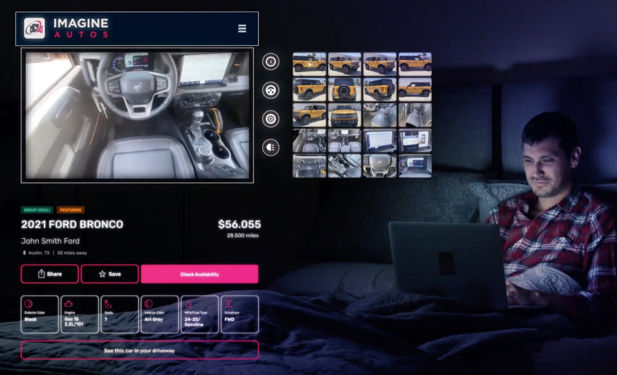
The client came to OTAKOYI with a ready-made concept of a mobile car search application and wanted us to develop a website on the basis of it. The goal of the project was to offer the end-user a car searching web platform in a similar corporate identity and also the same functionality as the mobile version. Since ImagineAutos.com collects car offers from numerous dealers, the key part was to provide a seamless navigation through the website so that the user could easily find what they want. Another goal was to display the most important information to the user, who might be overwhelmed with it in case of a failure with UX design.
However, we did our best and structured the search process so that a user learns the information about cars gradually. Moreover, since ImagineAutos.com is focused on video materials, we created an AI that divides videos into thematic parts, each of which is about a separate automotive part. After the successful launch of the website concept, the client asked to develop a mobile application for Android.
Challenges faced
The fact is that this segment is already quite well established, and car search patterns have long been formed and work well. In turn, the task of our team was to use existing patterns and, if possible, make improvements in terms of both usability and functionality, as well as visuals.
It was also crucial to correctly and conveniently structure the information on the car page for the website’s users. We aimed at showing all the most important things in the first place, while also not overloading a user with an excessive amount of information. That is why the project required a smart design approach and understanding of user interests.
Our approach
In order to achieve maximum efficiency, the OTAKOYI team created two User Personas (the representations of the target customers) and designed their User Flow, which is a complete path that a customer takes when using a product. Accordingly, we received essential information on various pain points that a user encounters while navigating through the website. Then we tried to remove possible obstacles and issues or at least minimize their impact on the user experience.

Source: Imagine Autos - Official Commercial (https://youtu.be/PWbvxrhpYHM)
Features Implemented
The website was built on a modern web stack, which includes Nuxt.js, Vue.js, and Vuex. It offers an advanced search system to easily and quickly find the needed product. Firstly, a user performs an initial search for certain global parameters (keyword, brand, model, carcass type, or zip code), and after the search, we offer him more detailed filters, such as price, year, etc. In this manner, the user always sees only the products they want, and this gradual searching system allows them to see the whole variety of available cars.
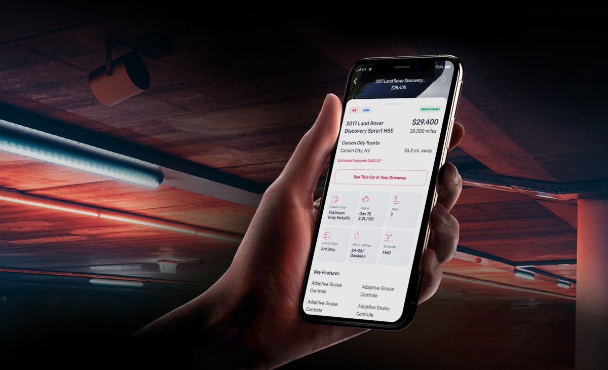
The user can authorize with email or Facebook. It is also possible to add a car to favorites, view selected cars, save search parameters, and view searches on the mobile app. We synchronized the website and the mobile app. Moreover, we migrated search to the Elasticsearch that resulted in speed optimization. In particular, there were occasions when the user had to wait for a response for approximately a minute, but now the same procedure takes place in under a second.
Besides, the Augmented Reality module was implemented. With its help, the user can see how the auto will look in the garage or on the street. AR allows 360 degrees rotation of the vehicle, the view of the salon, or a test-drive.
Source: Imagine Autos - Official Commercial (https://youtu.be/PWbvxrhpYHM)
Moreover, users have an opportunity to watch informative videos about the products on the search results page. These videos describe various important parts of cars. What is quite cool here is that these videos are divided into parts by Artificial Intelligence (AI). Each part presents a certain element of a car and provides users with information. AI determines where the parts start and end and offers clickable icons to turn on the necessary part of the video.
Value Delivered
While working on this project, the OTAKOYI design team paid special attention to user experience and navigation. The final website is extremely user-friendly and assists user flow on all steps, starting from the beginning of searches and to choosing the right product.
OTAKOYI managed to create a website that fully represents the corporate style of our client and corresponds to the requirements set before our team.
Experience Gained
We dove into the problems of the automotive industry, and this gave us an idea of the problems a user faces. From this point, the only thing that we had to do is to develop a smart decision to solve the most popular problems. In particular, we analyzed user needs, facilitated the choice and search of cars, and even implemented AI into UX for a smoother experience. This surely improved our expertise in the industry and usage of AI technologies, which will be quite beneficial in later projects.

During the website and mobile application development, we encountered a number of problems. The main one was that photo and video resources are not optimized for mobile and web. To solve this problem, it was proposed to optimize photos and videos on the go using CDN & cloud functions.
There were also a number of issues with the API. Request and response formats were not standardized, not optimized, and not completed. Sandbox, Staging, and Production environments were not synchronized. All of these caused numerous problems. Our specialists helped the client's developers bring everything to a unified standard.
The client already had an iOS team, but still we decided to write on the cross-platform SDK Flutter. The main reason for choosing Flutter was the lack of time and its ability to quickly build interfaces. On the functional side, Flutter was also a good choice. After we launched working MVP in 3 months, we understood that it was the right decision. One of the reasons was that the work with photos and videos caused most problems. The customer wanted this project to be unique and original, so we developed our own gallery and video player based on the video_player package.
There were also issues with video_player and exoplayer packages. We caught a number of bugs and decided to make a fork and then fixed the bugs and added functionality. Since working with photos and videos is a resource-intensive process, we had to pay attention to memory optimization. As a result, we got an application that works smoothly with photos and videos on Android. What is more, it is compatible with iOS. Since Flutter proved its worth, the client decided to use it with the iOS version too. This decision will facilitate the work in future as well as provide with the quality of the code.