case study
A decentralized communication app offering secure messaging, voice and video calls, event scheduling, file sharing, and digital identity — built for privacy, transparency, and full user control.

The audit examined the ease of use of the mobile app in its primary areas. The product has many features, but issues with clarity, navigation, and feedback made the experience less enjoyable. By studying how users complete essential tasks, the audit found problems that could affect adoption and long-term use. The primary goal was to transform these findings into design changes that enhance the app's usability without compromising its essential features.
The audit employed a straightforward, step-by-step process to identify both obvious UI problems and more profound structural issues. This approach ensured that the findings were detailed and ranked by importance and ease of implementation. Each step aimed to examine usability from different angles, including technical standards and real-world user tasks. Scope & Goals – Focused on login, onboarding, navigation, meetings, chats, and clubs as the most critical flows.
Heuristic Evaluation
Screens checked against Nielsen’s heuristics (system status, error prevention, user control, consistency).
Task-Based Walkthroughs
Simulated real tasks (login, password reset, meeting creation) to reveal flow-breaking points.
Consistency Check
Compared sections to find redundancies and inconsistencies (e.g., repeated features, hidden CTAs).
Documentation & Recommendations
Each issue is paired with actionable advice, and where needed, mockups to visualize fixes.

At every step, we looked at the interface with trusted usability principles in mind—clear design, consistency, helpful feedback, and making things easy to fix. Instead of just spotting one-off design issues, we thought about how every detail fit together and how even small problems could pile up for real people using the platform. Pairing these principles with hands-on testing let us tie best practices to the real moments where users might get stuck, so our suggestions are based on what actually matters in practice.
This helped us spot patterns such as:
Lack of Clarity
Some fields had no formatting examples (e.g., dates, phone numbers), making errors more likely.
Inconsistent Wording
Buttons like “Continue,” “Proceed,” and “Next” were used interchangeably, breaking flow.
Weak Feedback Loops
SMS verification provided no confirmation message, leaving users uncertain whether it succeeded.
Missing Error Handling
Input fields didn’t validate or guide users when mistakes were made.
This step gave us a structured lens through which to evaluate the product.
During the evaluation, immediate impressions were noted to capture authentic user-oriented perspectives. This helped highlight where design choices directly influenced perception, clarity, and ease of use.
First Impressions
Documenting the initial reaction when encountering a screen for the first time.
Emotional Cues
Observing moments of hesitation, frustration, or delight that arise during interaction.
Task Flow Continuity
Recording how natural or disrupted the experience feels while completing a task.
Cognitive Load
Identifying points where users may feel overloaded with instructions or options.
Confidence Signals
Assessing whether the interface provides enough reassurance for users to proceed comfortably.
By capturing these reactions in real-time, the evaluation extends beyond technical assessment and provides a human-centered view of how users truly engage with the product. This perspective ensures that design improvements directly address the lived experience of end users.

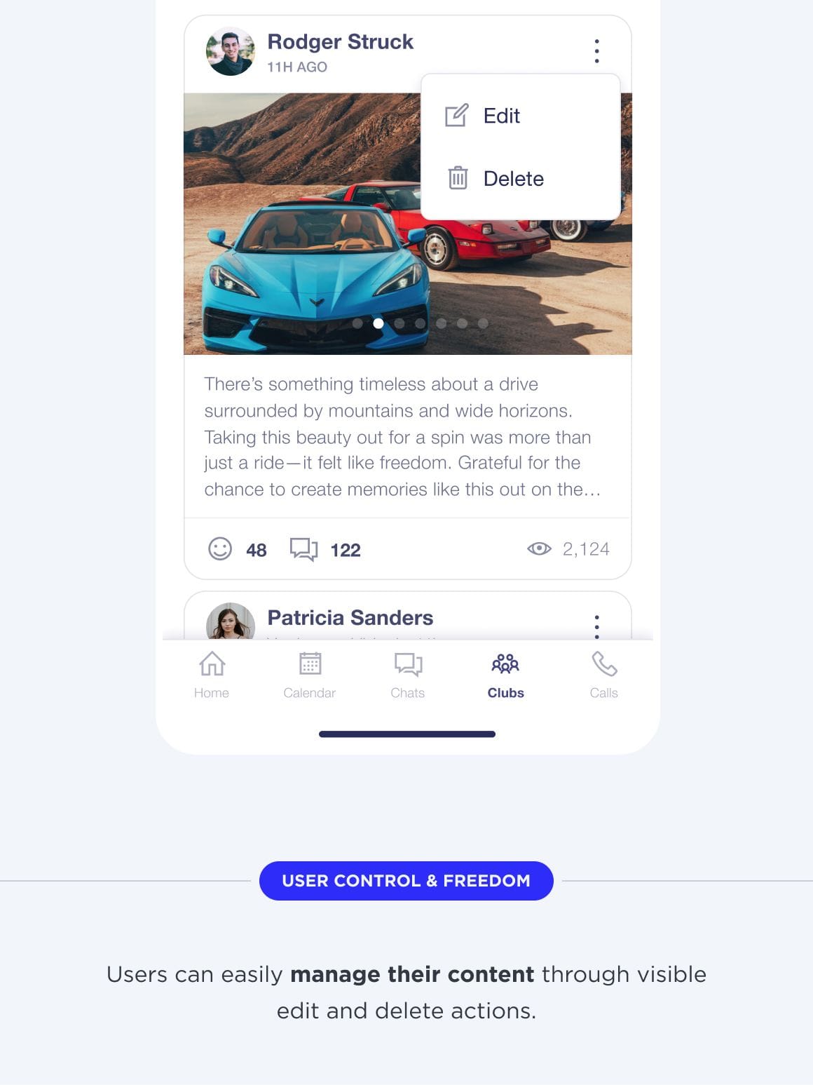
The audit revealed significant usability challenges across login, onboarding, meetings, and club-related flows. Core issues include poor readability, missing guidance, inconsistent feedback, and hidden or duplicated functionality. These create confusion, slow user progress, and reduce trust. Improvements should focus on clarity, consistency, and streamlined interactions.
The review examined login, password recovery, onboarding, home navigation, and collaboration features. Issues stem mainly from poor visual hierarchy, lack of feedback, unclear navigation, and redundancy in flows. These problems hinder users from completing essential tasks smoothly.
Readability Problems
Dark backgrounds, low contrast, and missing labels made input fields and instructions hard to read.
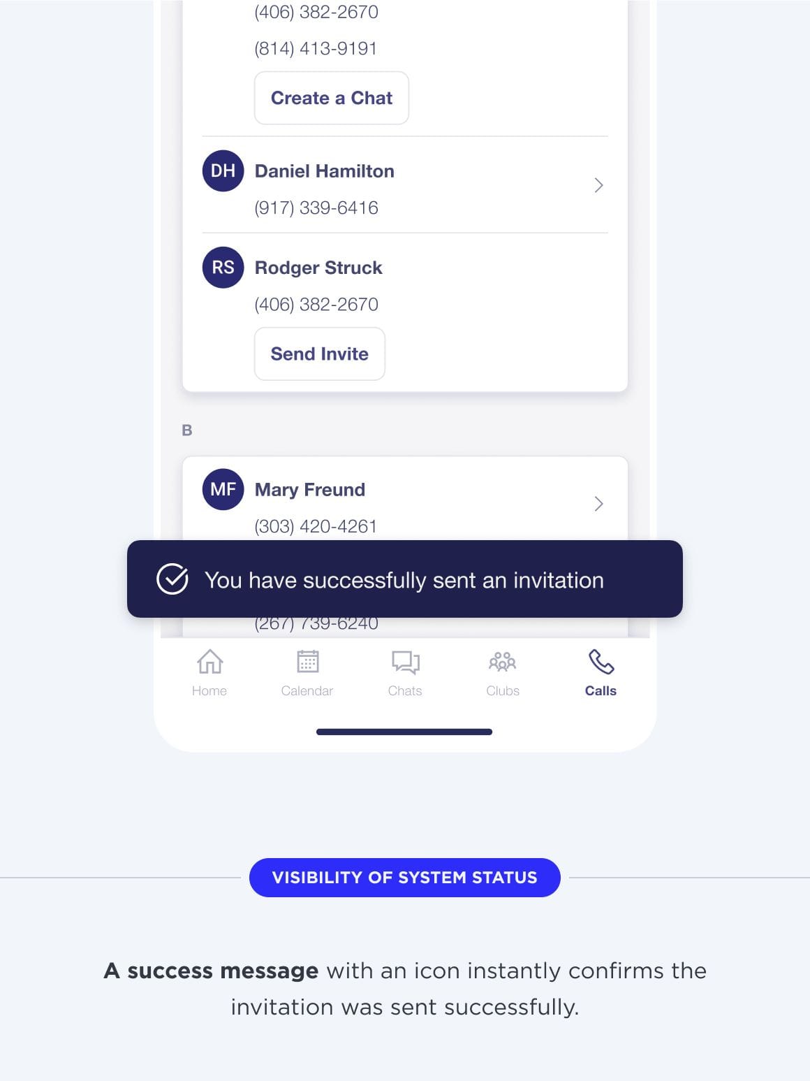
Insufficient User Feedback
Errors, confirmations, and success notifications were either missing or too vague to guide users.
Disjointed Navigation
Overlapping menus, hidden buttons, and missing navigation bars left users unsure how to proceed.
Inefficient Task Flows
Creating meetings, chats, or clubs required extra steps, lacked intuitive controls, and forced repeated actions.
Unclear Structure of Features
Key functions like “Digital ID” or club content overlapped with other areas, making the system confusing to explore.

Usability gaps overshadow the platform's core design potential. Fixing visibility, consistency, and flow logic will enhance user confidence, speed up onboarding, and improve engagement.
Improve Visual Clarity
Use higher contrast, cleaner layouts, and clear labels to make inputs and text readable at all times.
Strengthen System Feedback
Add informative errors, confirmations, and success notifications so users always know what happened.
Streamline Navigation
Introduce consistent navigation bars, visible CTAs, and logical grouping of settings for smoother orientation.
Simplify Task Execution
Reduce redundant steps in meetings, chats, and clubs by adding intuitive controls and direct shortcuts.
Reorganize Feature Placement
Group related functions (e.g., QR codes, encryption, club tools) under clear categories to avoid duplication.
Next steps should include usability testing with real users to validate improvements, alongside a redesign of core flows for login, onboarding, and collaboration. Prioritizing clarity, consistency, and reduced friction will make the experience more intuitive and reliable.
Discover more inspiring examples of user experience audits and usability improvements.
Get in Touch
We don't focus solely on technology. Technology is a tool that serves our clients' business objectives. Our priority is aligning technology with business goals, not the other way around.