case study
A financial services platform designed to help customers create and manage their accounts online. The audit focused on the onboarding and registration journey, a critical first step in building trust and enabling adoption.
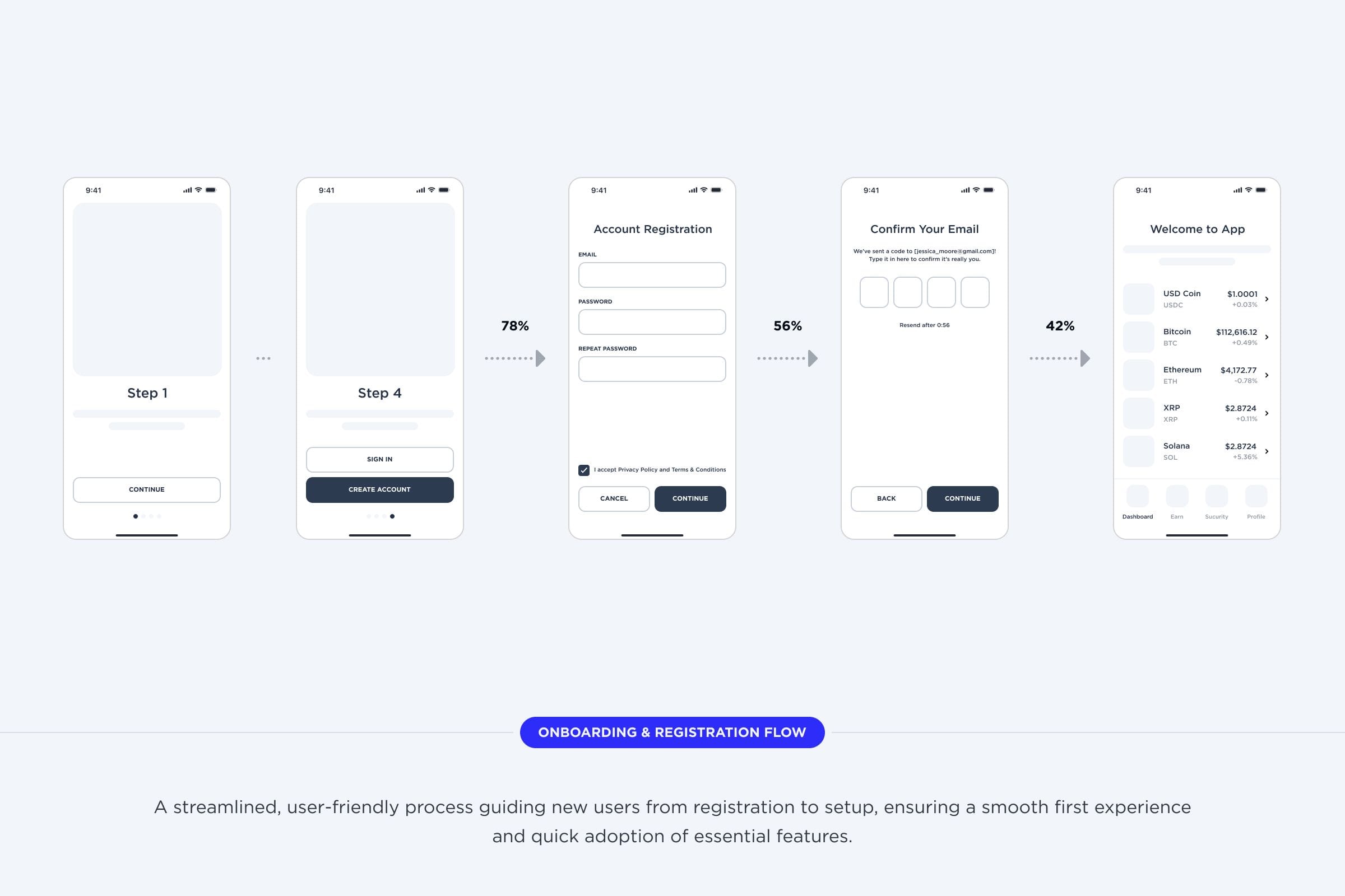
We took a close look at the onboarding and account registration process for a financial platform through a focused UX audit. Because this is a new user's very first interaction, any bumps in the road can quickly impact their trust and willingness to sign up. Our aim was to spot usability issues early and suggest ways to make the experience easier and more dependable for everyone.
The product is functional, but it doesn’t feel delightful to use. We see competitors offering smoother, more polished experiences, and I want to close that gap so our product doesn’t just work, but stands out.
We kicked things off by walking through the whole user experience ourselves—from signing up, to logging in, to recovering lost credentials. Rather than just looking at each screen by itself, we paid attention to how every step flowed into the next. That helped us spot little hiccups you might not notice otherwise, like confusing form labels, buttons that didn’t always work the same way, or having to verify details more than once.
At every step, we looked at the interface with trusted usability principles in mind—clear design, consistency, helpful feedback, and making things easy to fix. Instead of just spotting one-off design issues, we thought about how every detail fit together and how even small problems could pile up for real people using the platform. Pairing these principles with hands-on testing let us tie best practices to the real moments where users might get stuck, so our suggestions are based on what actually matters in practice.
This helped us spot patterns such as:
Lack of Clarity
Some fields had no formatting examples (e.g., dates, phone numbers), making errors more likely.
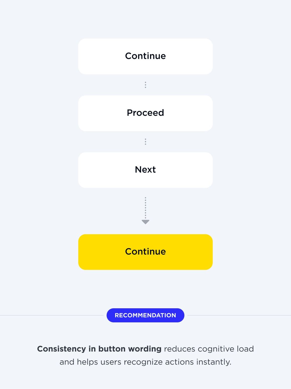
Inconsistent Wording
Buttons like “Continue,” “Proceed,” and “Next” were used interchangeably, breaking flow.
Weak Feedback Loops
SMS verification provided no confirmation message, leaving users uncertain whether it succeeded.
Missing Error Handling
Input fields didn’t validate or guide users when mistakes were made.
This step gave us a structured lens through which to evaluate the product.

As we worked through the flows, we didn’t just rely on checklists—we also wrote down our honest, in-the-moment reactions. These notes captured the real, human side of using the platform, showing not only what went wrong technically but also how it actually felt to be in the user’s shoes. By recording little moments of hesitation, frustration, or confusion as they happened, we built up a picture of the small annoyances that can slowly chip away at trust. This approach connected the dots between official usability rules and what it’s actually like for someone using the product. The end result? Our findings felt more down-to-earth and useful, because they reflected how real people experience these moments—not just what’s on paper.
This approach ensured we documented not only design flaws but also the feelings they triggered.
We added more techniques to the audit, not just the usual walkthroughs and heuristic checks. These extra steps gave us a broader view, helped confirm our findings, and revealed issues we might have missed.
Quick User Testing
Informal testing with non-target users confirmed that confusion wasn’t just our interpretation.
Content Review
We assessed UX writing for tone, clarity, and helpfulness. In several places, labels or instructions created ambiguity rather than support.
Visual Evaluation
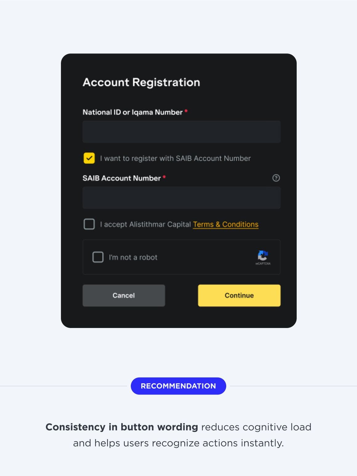
We checked typography, color contrast, and hierarchy. For example, in dark mode, some input fields had such low contrast that they became nearly invisible on certain screens.
Accessibility Check
We reviewed whether flows were accessible to a wider audience. Low contrast and missing labels were flagged as barriers.
Together, these methods gave us a well-rounded perspective on the experience.

The UX audit uncovered critical usability and consistency issues across onboarding. Problems included unclear input handling, weak error messaging, redundant steps, and accessibility gaps. While visually polished, the product’s functional experience needs improvement to reduce friction and build user trust.
The audit covered key onboarding flows, using heuristic reviews, accessibility checks, and quick testing. Findings show that users face confusion, lack guidance, and encounter unnecessary friction, which could reduce completion rates.
Unclear Input Handling
Fields lacked masks, validation, and tooltips, making data entry confusing and error-prone.
Weak Error Messaging
Mandatory fields often lacked feedback, while active buttons allowed incomplete submissions.
Redundant Registration Steps
Extra fields and unnecessary verification increased friction despite existing SMS confirmation.
UI and Accessibility Issues
Inconsistent labels, poor contrast in dark mode, and limited accessibility compliance.
Fragmented User Flow
Key pages weren’t integrated into steppers, leaving user progress unclear and disjointed.

The audit confirms that while the interface design is polished, the overall usability is hindered by gaps in logic, clarity, and accessibility. Addressing these areas will improve efficiency, reduce user frustration, and create a more trustworthy onboarding journey.
Strengthen Input Support
Provide masks, examples, and inline tips to guide accurate field completion.
Enhance Error Visibility
Introduce dynamic messages and highlight problem areas to improve correction speed.
Simplify Authentication Steps
Consolidate redundant checks and keep verification limited to essential actions.
Standardize Design Patterns
Align labels, buttons, and visual states to ensure consistency and inclusivity.
Test With Real Users
Conduct moderated usability sessions to validate flows and uncover hidden issues.
The next stage should begin with a Discovery phase involving UX and business specialists to map flows and align with real user needs. After updates, usability testing will be essential to confirm that changes improve completion rates and reduce friction before scaling further.
Discover more inspiring examples of user experience audits and usability improvements.
Get in Touch
Every great project needs more than a vendor — it needs an ally. That’s exactly the role my team and I take on.