The sad fact is that very few frontend developers correctly understand the concept of accessibility and its role in website development. Developers often say something like: "Why waste time on this?" or "This site can be used anyway." However, such a reaction only means that these devs do not have an understanding of accessibility and ways to achieve it. Therefore, let us once and for all define accessibility and why do we need it in web development.
What is Accessibility?
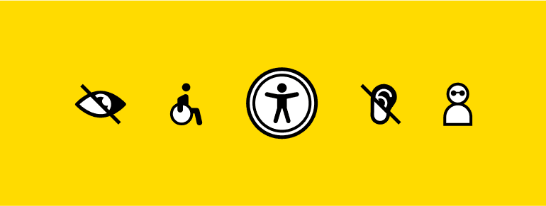
Accessibility is a practice that allows as many people as possible to use your site. Traditionally, developers have the idea that "Accessibility" means the possibility for people with disabilities to use the site. In fact, this practice describes approaches for the convenience of absolutely all users, such as mobile users, or users with a slow connection, but let us come back to this a little later.
What is an Inaccessible Site?
An Inaccessible interface is the one that is comfortable for a user with perfect vision, good hand motility, a large monitor, a mouse, and a bunch of other additional factors. If suddenly the user is not as you imagine them - this is their problem.
Why Might the Site Be Inaccessible?
A perfect example would be if visual defects are implemented with the use of bright light or the UI has poor color contrast. For instance, dark themes, which have become very popular recently, might be the reason for that. A dark theme is very convenient, but it is convenient only if it is possible to switch to a light theme.
The problem is that under bright sunlight, it is simply impossible to use the interface with a dark theme due to the lack of visibility. Poor color contrast limits users with incorrect monitor settings. Not all users use monitors with perfectly adjusted colors. If the contrast of your interface is bad, the user may not see some elements of this interface.
There are numerous other problems usual users often encounter. They include a broken mouse or touchpad, a small screen, a slow connection, etc. Imagine a situation where the user’s mouse has broken, and if they want to order a new mouse, it would be impossible with an inaccessible website. Also, if the user has slow Internet, he will not be able to use the site if it is not optimized.
Another example may be that inputs do not support autocomplete or insert functions, Users do not like to remember passwords, card data, or other confidential information. Users like to use autocomplete, password managers, or, as a last resort, a text file with passwords from which they can copy and paste the password. Inputs must support the ability to quickly and easily insert login and password, card data, etc.
As for the font, everything is quite simple: if the mobile text is too small and in addition the ability to scale the site is disabled - the site is inaccessible.
Scripts instead of links deserve special attention. Developers tend to use react-router, Vue-router, and others, which allow inserting links into HTML. However, some devs like to switch between pages with buttons that launch the push method for the router. As a result, the website becomes inaccessible for users with screen readers. Instead of the push method, you should use <Link> components based on the <a> tag.
Physiological Difficulties
Finally, this is the part, which is often perceived as accessibility. However, it is only one of its components. In short, physiological defects should not interfere with the use of your interfaces. Let us dig into some details:
Visual impairment
This category includes people with complete blindness, poor eyesight, color blindness, and other problems. Such people use screen magnifiers and screen readers. According to the WHO, 285 million people worldwide suffer from visual impairments, 39 million are blind, and 246 million have poor eyesight. If your site is made inaccessible, you deprive a group of people as large as the US population of using it.
Screen readers
Here is a list of the most popular screen readers, all of which are free solutions:
- NVDA - Windows
- Chrome screen reader - Chrome
- Orca - open-source solution for Linux
- Voice Over - macOS and iOS
- Narrator - Windows
- TalkBack - Android
To know how it works, it is best to try using one of the screen readers above by yourself. This will immediately give you an opportunity to understand how visually impaired people use the web and what is important to them.
Hearing impairment
There were no software solutions for people with hearing impairments. However, in the last couple of years, there have been shifts in this direction. In 2019, together with Android 10, Google showed Live Caption technology. This is a utility that allows you to convert a soundtrack to subtitles on the fly. Starting with 88 Chrome, released in February 2021, this technology is available on Windows, Mac, and Linux via the Chrome browser. As for now, subtitles are generated only in English, but Google is developing this technology and testing the recognition of other languages.
How can we help people with hearing impairments?
Very often the sites we make are silent. However, very often we need to insert a video on the site. To help hearing-impaired users, we can insert subtitles into the video. Even a regular HTML video without third-party libraries can handle this. The video element supports a “track” tag that will add subtitles to your video. Okay, we can insert subtitles into the video, but how to generate a file with subtitles?
<video id="video" controls preload="metadata"> <source src="video/sintel-short.mp4" type="video/mp4"> <track label="English" kind="subtitles" srclang="en" src="captions/vtt/sintel-en.vtt" default> <track label="Deutsch" kind="subtitles" srclang="de" src="captions/vtt/sintel-de.vtt"> </video>
There are free utilities, but they are mostly for Windows. You can also find shareware utilities for Mac and Windows. Besides, there are relatively free online generators, which are enough for short videos. Unfortunately, not everything is as simple as we would like. But everything is not so bad: conditionally free online generators can cover most needs of the usual site. It is possible to use video from YouTube, where there is an automatic generation of subtitles.
Notifications
Some sites use beeps for notifications, but in certain states, these notifications may not be visible (for example, the notification comes only in the header, and the user scrolled the page).
Here are the ways to make notifications accessible:
- A regular toast message can make notifications available;
- Fixed notification icon (this can be a fixed header that has a fixed notification icon);
- Dynamic change of the title and favicon so that notifications can be seen from other tabs;
- System notifications (Android, iOS, macOS, Linux, Windows)
Physical limitations
Physical limitations can differ from each other. However, the result is almost always the same - the inability to use a mouse or touchpad. Your site must be accessible for keyboard navigation. The navigation keys are the same on all platforms that you can connect a keyboard: pressing Tab moves the focus to the next element; Shift + Tab moves the focus to the previous element; Space presses the button; Enter allows going to the link.
Focus
Everyone has seen a similar piece of code in projects:
:focus { outline: 0; }
If your site's code contains these 3 lines of code, it is unavailable. Focus plays a very important role in site navigation. It allows the user of the site to understand where he is now when accessing from a keyboard. If you do not like what the outline looks like - turn it off and replace it with border, box-shadow, or somehow change the feature of the focused element. Its peculiarity is that it shows the possibility of interaction with a certain element at a particular time.
As was mentioned above, there are two main keyboard commands responsible for navigation: Tab and Shift+Tab. Tab moves the focus to the next element. Shift + Tab moves the focus to the previous one. Also, you need to remember that tabindex controls focus, tabindex = "0" adds to order, and tabindex = "- 1" makes it interactive. An element with tabindex = "- 1" cannot be accessed from the keyboard, but it becomes available for focus, and in the case of a necessity the user can focus on this element with JavaScript. If tabindex is more than 0 it becomes quite problematic. Yes, with tabindex you can change the order of focus, but you should not do this because such code is not scalable at all and there may be problems with adding or removing elements from the page.
It is also worth adding that in normal circumstances, the order of the elements is in the order of HTML, so you should be very careful when changing the order of the blocks in CSS.
Semantics
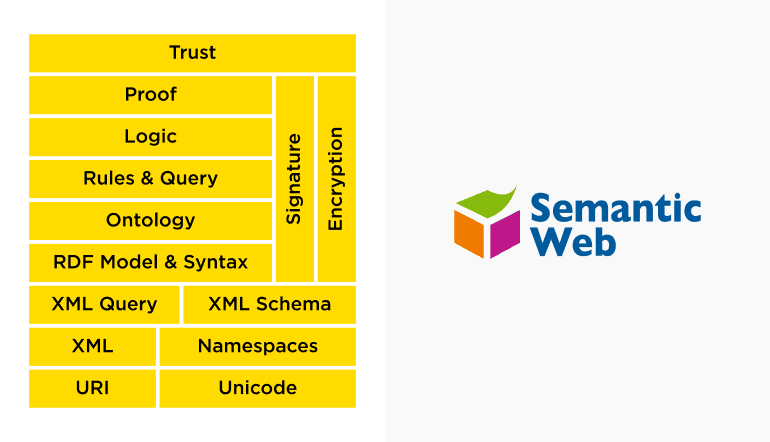
So far, we have been talking about accessibility in terms of theory and motivation. Now is the time to move on to the practical component. It may seem that in 2021 absolutely everyone knows about semantics, they talk about it, they demand it, semantics is taught at 100% of modern courses, at least at the basic level. However, from time to time, developers do not understand the very basics of semantics. Therefore, this part will be devoted to the basics of semantics, and why it is needed.
A Little History

By mid-2019, there were two competing HTML specifications. W3C (numbered versions) and WHATWG (HTML Living Standard). In mid-2019, a memorandum was signed between the W3C and the WHATWG that made all W3C specifications obsolete (including HTML 5.2). The W3C and WHATWG are currently working together on the HTML Living Standard.
HTML Living Standard:
Here is the link to the current HTML specification. However, there may be difficulties in studying this specification because it is written in a quite dry manner.
MDN
An alternative is the MDN resource . There is good documentation for HTML, articles on accessibility, semantics, and much more. You can find a lot of interesting things there.
Tags
Why one should memorize a bunch of different tags if there is one good, time-tested <div> tag? You can add classes, customize from Figma as you want, and you are done. Battle-hardened front-end devs know about the role attribute. No problem, we can finish... Not quite.
A real-life example
<div class="wrap cheader__wrap"> <div class="cheader__content"> <h1 class="title"> Name of the company </h1> <div class="cheader__sub"> Corporate platform </div> <div class="cheader__intro text-l"> Update and modernization of the corporate site</div> </div> </div>
Imagine an absolutely typical block on a site. The title was added as <h1>, not bad, but for some reason, the text remained as <div>. Yes, you can see that classes are added here. As a developer, you can understand what is happening here.
<heading> Name of the company </heading> Corporate platform Update and modernization of the corporate site
However, a search engine robot and screen reader sees the in this way: yes, there is a title, very good, the name of the company is very important, but everything else - does not matter, it is just a bunch of words that will say nothing to the screen reader.
It may seem that this is too far from reality and no one is doing so, but in fact, they are very common.
Here is another way to do it:
<section class="cheader__content"> <h1> Name of the company </h1> <h2> Corporate platform </h2> <p> Update and modernization of the corporate site </p> </section>
Now the screen reader will see the title <h1> and will not stop there, it will read further. It will see that there is also a title, less important, but still not just unnecessary text. It will also see the paragraph and will understand that it is a text. Furthermore, it will understand that this text has a purpose, and it could be read.
It takes approximately 5 seconds to replace div with <h2> and <p>. Another 10+ seconds can be spent on resetting the default styles that came with the new tags if needed. However, instead of rewriting this, one should do it properly right away, and no additional time and effort will be spent.
Why do we need lists?
<nav> <ul> <li><a href="">Home</a></li> <li><a href="">Projects</a></li> <li><a href="">Contacts</a></li> </ul> </nav>
Here you can see the typical structure for navigation. There is nothing special in it: nav and a list of links. Everything is semantic. Imagine that you are using a screen reader, and you get to the first link by pressing Tab.
Here is how the screen reader will read this code:
Navigation - List - First of three - Links - "Home." The screen reader will look above, see that the link is part of the list, see that it is navigation, and help its user to understand what is happening in focus.
Here is one more reason why do we need lists:
<div class="menu"> <a href="">Home</a> <a href="">Projects</a> <a href="">Contacts</a> </div>
This is also a fairly typical structure. We as developers can understand what is happening here. There is a class "menu", there are links. It can be beautifully styled, and it will even work somehow. No lists and as a result, the code takes up less space. There were 7 lines of code, and now there are 5, which means fewer characters and lighter HTML.
However, the screen reader will read it like this:
Links - Home. As for the user who sees the interface, one can understand what is meant. If the user does not see the page, they will have in focus some "Main link", which leads to somewhere unknown place.
Landmarks:
As a developer, you design your site so that screen readers understand where to quickly find the information they need. Most screen readers have a function to quickly move around the site, that is, instead of reading the site line by line, a user can immediately go to main or footer, or header, and so on.
Headlines:
Screen readers also have a header reading mode. For faster information retrieval, the screen reader user can run through the titles and quickly find what it needs, instead of reading everything in a row, so the titles are very important on the page.
Interactive elements:
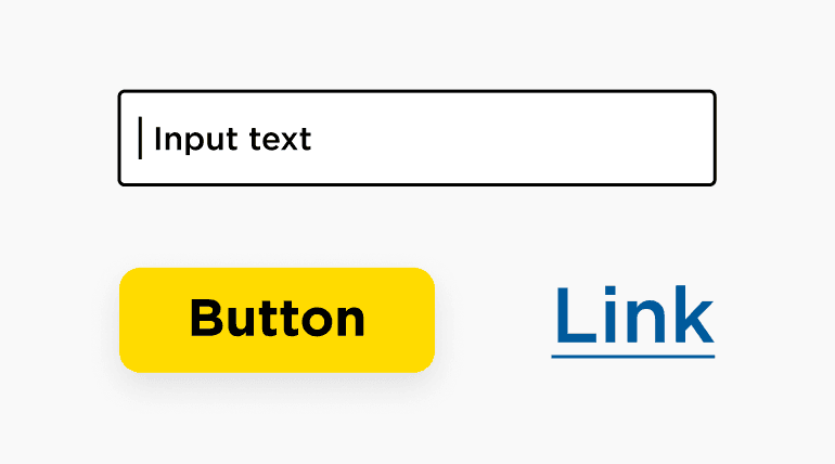
These are the elements by which we can move from the keyboard and interact with them without a mouse. For example, think of usual text input. If we press Tab, then the input will be in focus, and we will be able to type something in there.
So, how do you choose between a link and a button?
Very often when you look at the design you do not understand what to choose, a link or a button. Links look like buttons, buttons look like links. It is not clear. The rule comes to the rescue: This is always a button. Whenever you need to make an item that you need to click on and something happens - it is a button. If you feel that something is wrong and the functionality of a button is not enough, use the link.
Labels
Labels are not exactly what we often mean by this name. A label is not just an element that you can click on and interact with, for example, a tied checkbox. This concept is a bit broader.
Element Content:
The text inside a link is its label.
Group title:
The text inside the title of the legend group is the label of the group of form elements.
Related items:
The usual label for input that we all know about is also a label.
Hidden label:
You can hide the text inside a simple link without display: none - and it will also be a label, the screen reader will read it.
Label added:
A special aria attribute aria-label allows you to add a label to any element and only the screen reader can see and read it.
What is it for? Very often we add to the page a button that contains some Unicode symbol that means something, or 3 blank blocks that we style as 3 lines of a burger button, or 2 lines for a cross, or an svg icon. However, the screen reader does not see the page the way we see it. Unicode's symbols are not read as they look, crosses and burger buttons from blocks are a void. You have to help the screen reader and set a label for your item. The screen reader must read and tell the user what is depicted on the element.
Like button:
The screen reader does not see what a beautiful icon you have inside your button. Help it, just write what is depicted on the icon.
<button> <svg aria-label="Like!"> <use xlink:href="#like"></use> </svg> </button>
Unicode:
If you use a Unicode character, add a label that will tell the screen reader how to call this character. You can also use the aria-hidden attribute to hide a Unicode character from the screen reader so that it will not even try to read it.
<button aria-label="menu"> ☰ Menu </button> <button> <span aria-hidden="true">☰</span> Menu </button>
How to check the page for accessibility?
Chrome has a built-in Lighthouse tool. Unfortunately, he is not very strict and forgives a lot, but it will be able to catch the most serious mistakes and help to avoid them.
The inspector has long included an accessibility inspector by default. For a beginner, it may be unclear, but you can use it and find problem areas on your site.

Ready to start a project?
contact usConclusions:
Semantics is a really important concept, but devs often associate it with something that it is not. We are all used to thinking that semantics is about <section>, <article>, <b>, <strong>, and so on. Semantics is not about that. If you do not know what to choose, <section> or <article> - choose <div>. The end user will not suffer from this. Screen readers do not care how much time you spend picking up a wrapper tag.
Instead of worrying about tag, try to pay more attention to the content.
Language
Just specify the language because people use translators. Without the Lang attribute in HTML, the translator does not know from which language to translate.
Headers
Try adding more headers. A large number of headers does not mean that the screen reader will shout at your user. Instead, titles will allow you to easily navigate the site.
Pictures
It is not difficult to sign the pictures. However, it will make a big difference for the user, who does not see the picture. In such a way, they will know what is depicted.
Figures
Just tie your blocks. If you are not familiar with the figures, you would better read about them. This is a very effective tool for logically linking your elements.
Lists
Lists are crucial for people with visual impairments. With their help, these people can understand where they are since the screen reader will tell them what is in focus.
Besides the content, semantics also concerns the interface:
Landmarks
Let users know how your page is built. It is not difficult.
Form elements
Let users know what your form looks like and why.
Interactive elements
As simple as it may seem, use buttons for buttons and links for links!
Labels
Tell the screen reader how to read your site to the user.
As you can see, accessibility does not cause a lot of problems to developers, who just have to comply with a few simple rules. However, if the standards of accessibility are neglected, the users with special needs or those with non-conventional gadgets will not be able to access your website. Thus, by the proper organization of your development process, you may create a site that is convenient for everyone.
Further Reading:
A community-driven project that will help you achieve accessibility: https://www.a11yproject.com/
Documentation and tutorials: https://developer.mozilla.org/en-US/docs/Web/Accessibility?retiredLocale=uk
Accessibility standards: https://developer.mozilla.org/en-US/docs/Web/Accessibility?retiredLocale=uk
A document with a part of the content covered in the Udacity course on Accessibility: https://developers.google.com/web/fundamentals/accessibility
Web Content Accessibility Guidelines (WCAG) Overview: https://www.w3.org/WAI/standards-guidelines/wcag/
